
Browse the documentation
How to make banner ads responsive
Applies to: Publishers
A fixed 728x90 banner breaks a phone layout, and a 300x250 looks lost on a wide desktop column. There are three ways to make banners fit the space they are given. Pick the one that matches how your site is built.
| Way | What it does | Best for |
|---|---|---|
| Responsive Banners zone | A zone whose width and/or height follow the container on your page. | New placements in fluid layouts. |
| Code parameters on a banner zone | Display Responsive scales the banner to the container's width; AutoDetect Available Size measures the free space and asks for a banner that fits. | Existing banner zones, on platforms that offer these parameters. |
responsive in the ad controller code |
Sets the banner image to 100% width and lets the height follow. | Sites that already use the ad controller code with options. |
Before you start#
- The container that holds the ad must have a real size on the page. An ad placed in an element that is 0 pixels wide or high cannot be seen, even though it is served.
- You need to be able to edit the page or template where the ad goes.
Steps#
Option A: a Responsive Banners zone#
- Open Adzones and click New Ad Zone.
- Fill in Name your ad zone, choose Responsive Banners under Adzone Type, and pick the site under Select your website.
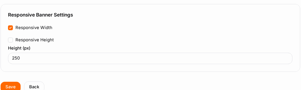
- In Responsive Banner Settings:
- Tick Responsive Width to let the width follow the container, or leave it off and enter a fixed Width in pixels.
- Do the same for Responsive Height and Height. A common choice is a responsive width with a fixed height.
- Click Save, open the Ad Zone Code tab and click Copy ad code.
- Paste the code inside a container that has a width (and a height, if the height is responsive), for example
<div style="width:100%;max-width:970px;min-height:90px">.
Option B: parameters on a banner zone#
- Open an existing Banner Ads zone and go to the Ad Zone Code tab.
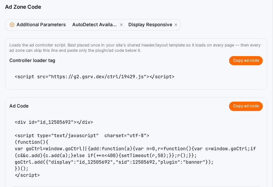
- Open Additional Parameters and pick Display Responsive, AutoDetect Available Size, or both. The code updates as you pick.
- Click Copy ad code (or copy the iframe Code) and replace the old code on your page.
AutoDetect Available Size measures the space when the page loads and again when the window is resized or a phone is turned, and requests a banner that fits. If you don't see these parameters, your platform does not offer them; use option A.
Option C: the ad controller option#
If your pages use the ad controller code with options, add "responsive":1 to the banner zone's options. The image then fills the container's width and the height follows. See Ad Controller for where the options go.
Check it worked#
- Open the page on a desktop and resize the browser window from wide to narrow: the banner follows the width without sticking out.
- Open it on a phone, or with your browser's device mode, in portrait and landscape.
- In the zone's Statistics tab, views keep coming in. A sudden drop in clicks with views still counting can mean the ad is served into a container that has no size.
Troubleshooting#
| Symptom | Likely cause | Fix |
|---|---|---|
| Views are counted but nothing is visible | The container is 0 pixels wide or high (for example a collapsed div or a hidden tab). |
Give the container a width and a minimum height. |
| The banner overflows on phones | The old fixed-size code is still on the page. | Copy the code again after changing the zone or its parameters. |
| The banner is stretched or blurry | A small creative is scaled up to a wide container. | Limit the container with max-width, or use AutoDetect Available Size so a larger banner is chosen. |
| The layout jumps when the ad loads | No height was reserved. | Set a min-height on the container. |
| The parameters are missing | Your platform does not offer them for this zone. | Use a Responsive Banners zone instead. |